TSN - Case Study
The Problem:
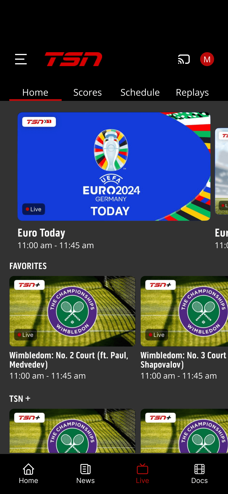
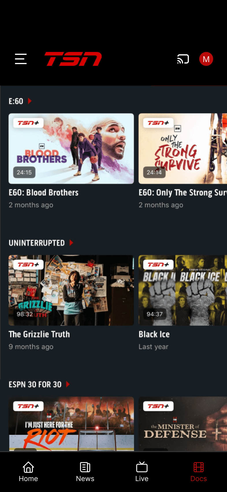
The TSN app, while offering a wealth of sports content, suffered from a confusing navigation system. Multiple navigation types (bottom tab bar, top tab bar, hamburger menu) created inconsistencies and made it difficult for users to find the content they were looking for. The lack of a centralized menu further contributed to a disorienting user experience.
The Solution:
Redesigned the TSN app's information architecture and navigation system to provide a more intuitive and user-friendly experience. This involved:
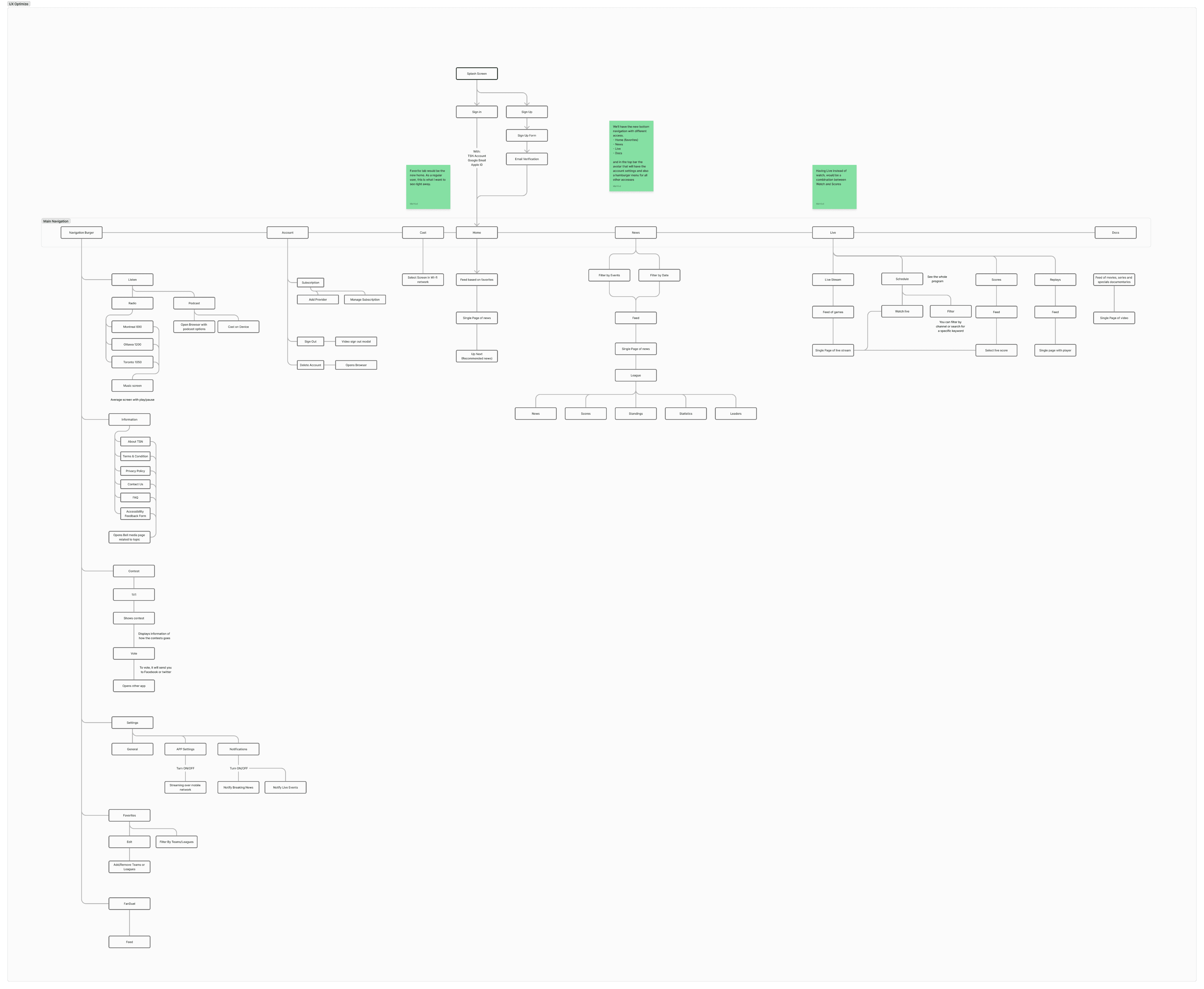
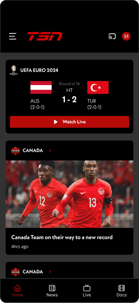
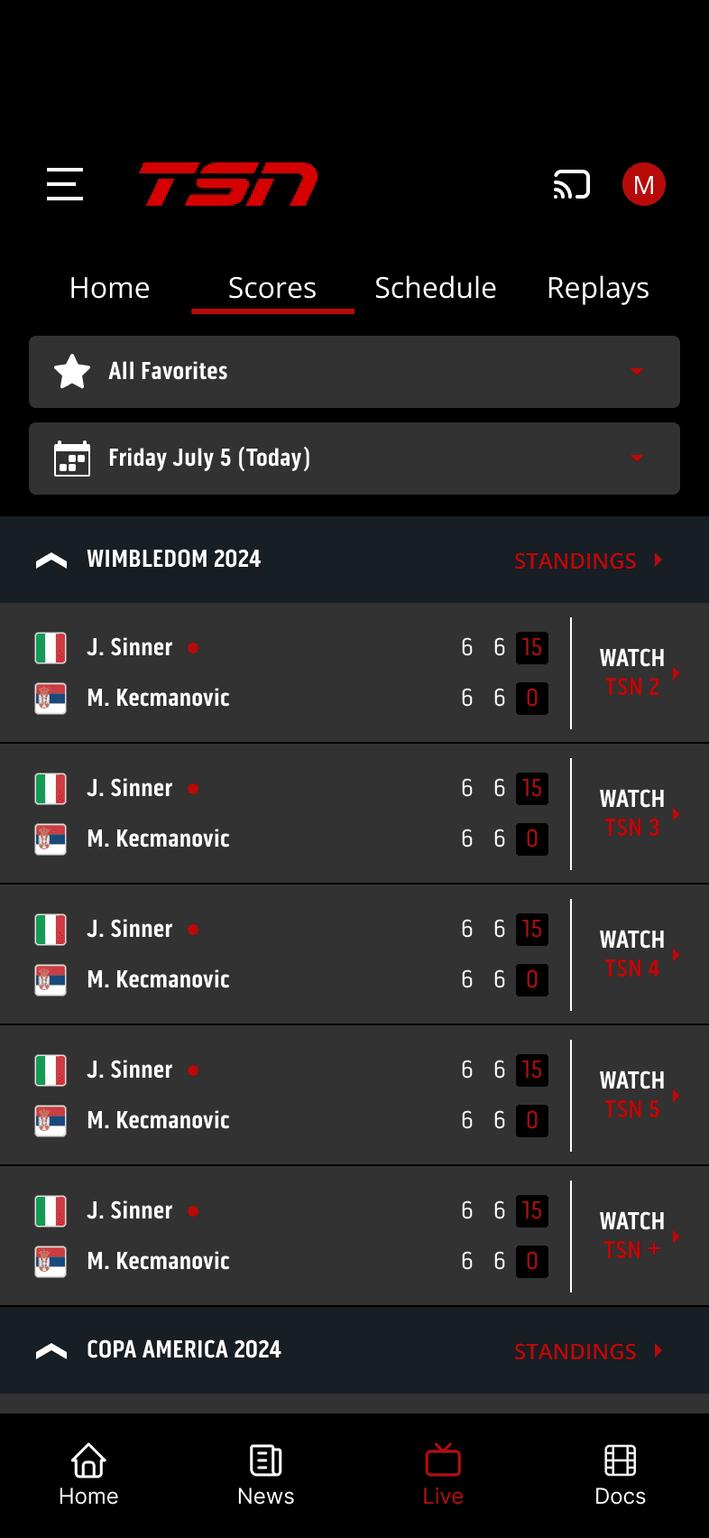
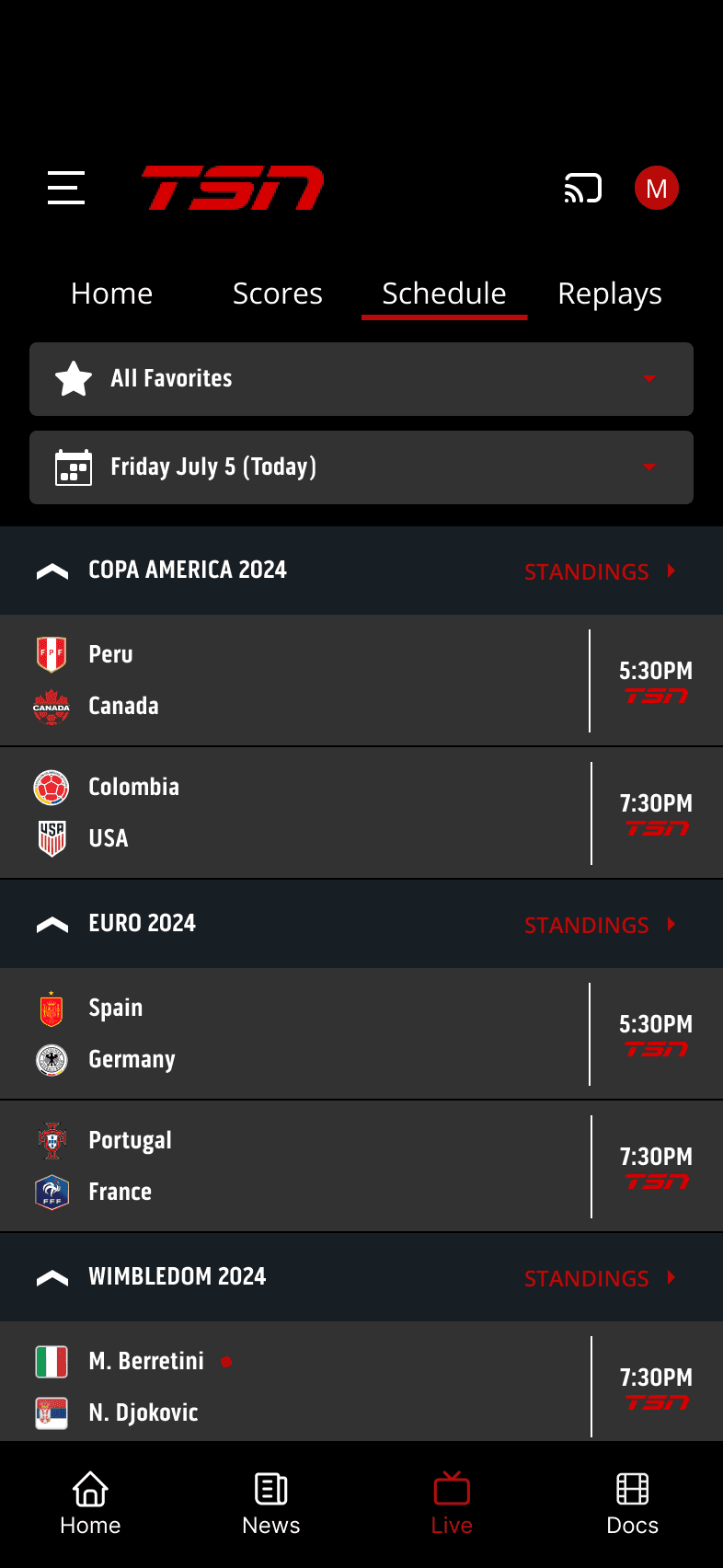
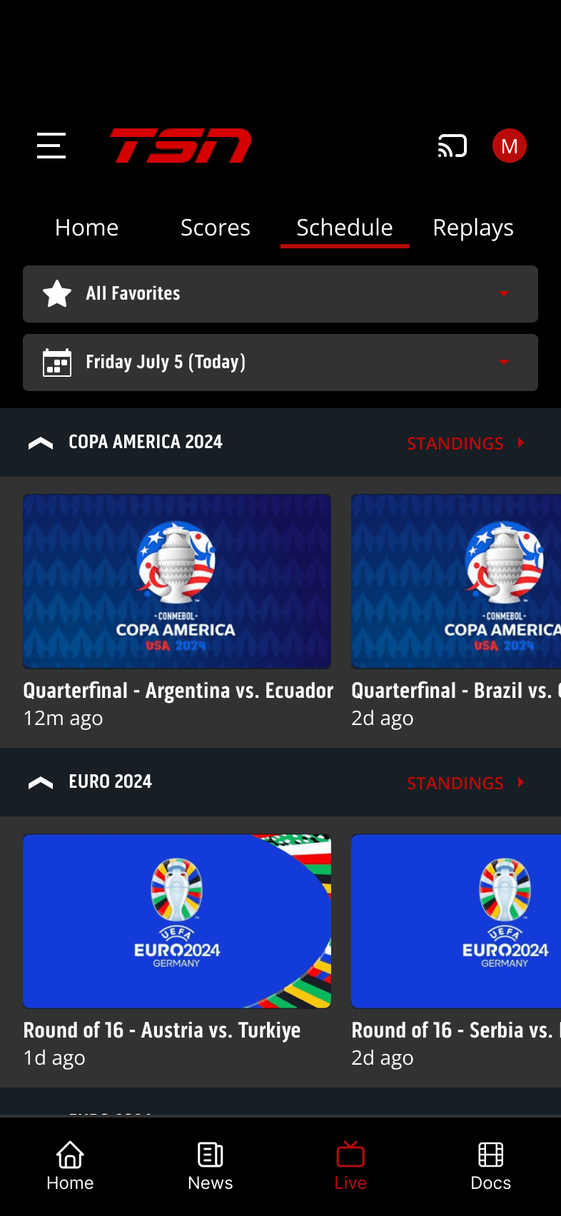
Simplified Navigation: Consolidated the navigation into a single, consistent pattern, likely a bottom tab bar for primary sections and a clear hierarchy within each section.
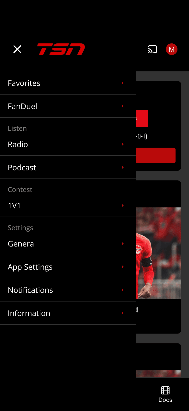
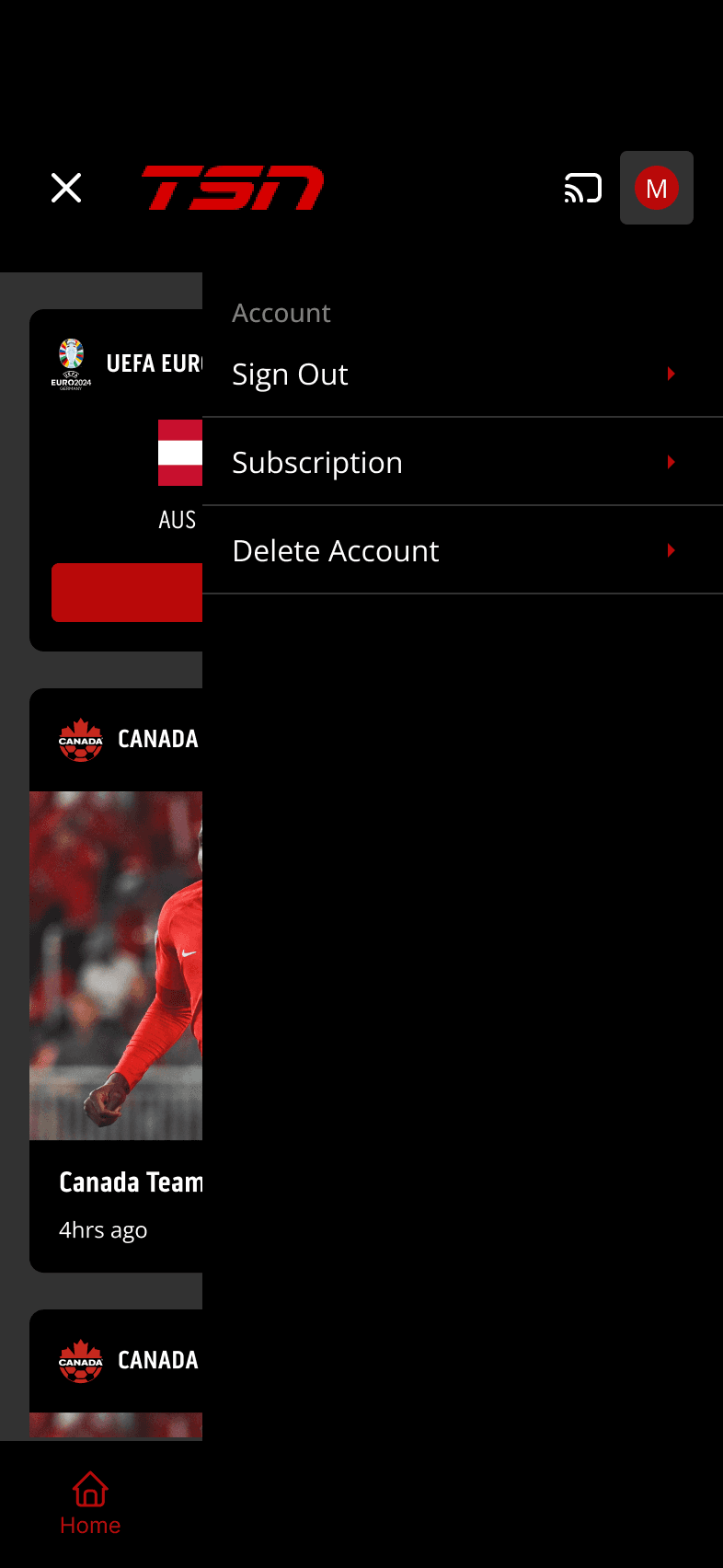
Centralized Menu: Introduced a main menu (potentially a hamburger menu or a user profile section) to provide easy access to all major sections and features of the app.
Improved Information Architecture: Reorganized the app's content, creating a logical and predictable structure that allows users to quickly find what they need.
The Journey:
Conducted a thorough analysis of the existing app, identifying pain points in the navigation and information architecture.
Explored different navigation patterns and information hierarchy models to determine the most effective solution for the TSN app.
Created user flows and wireframes to map out the new navigation system and content organization.
Developed interactive prototypes to test and refine the proposed solutions, ensuring a smooth and intuitive user experience.
The Result:
Delivered a redesigned TSN app with a simplified and user-friendly navigation system. By streamlining the information architecture and consolidating navigation, the app became more intuitive and easier to use. This likely resulted in increased user satisfaction, improved content discoverability, and a more engaging overall experience for sports fans.